
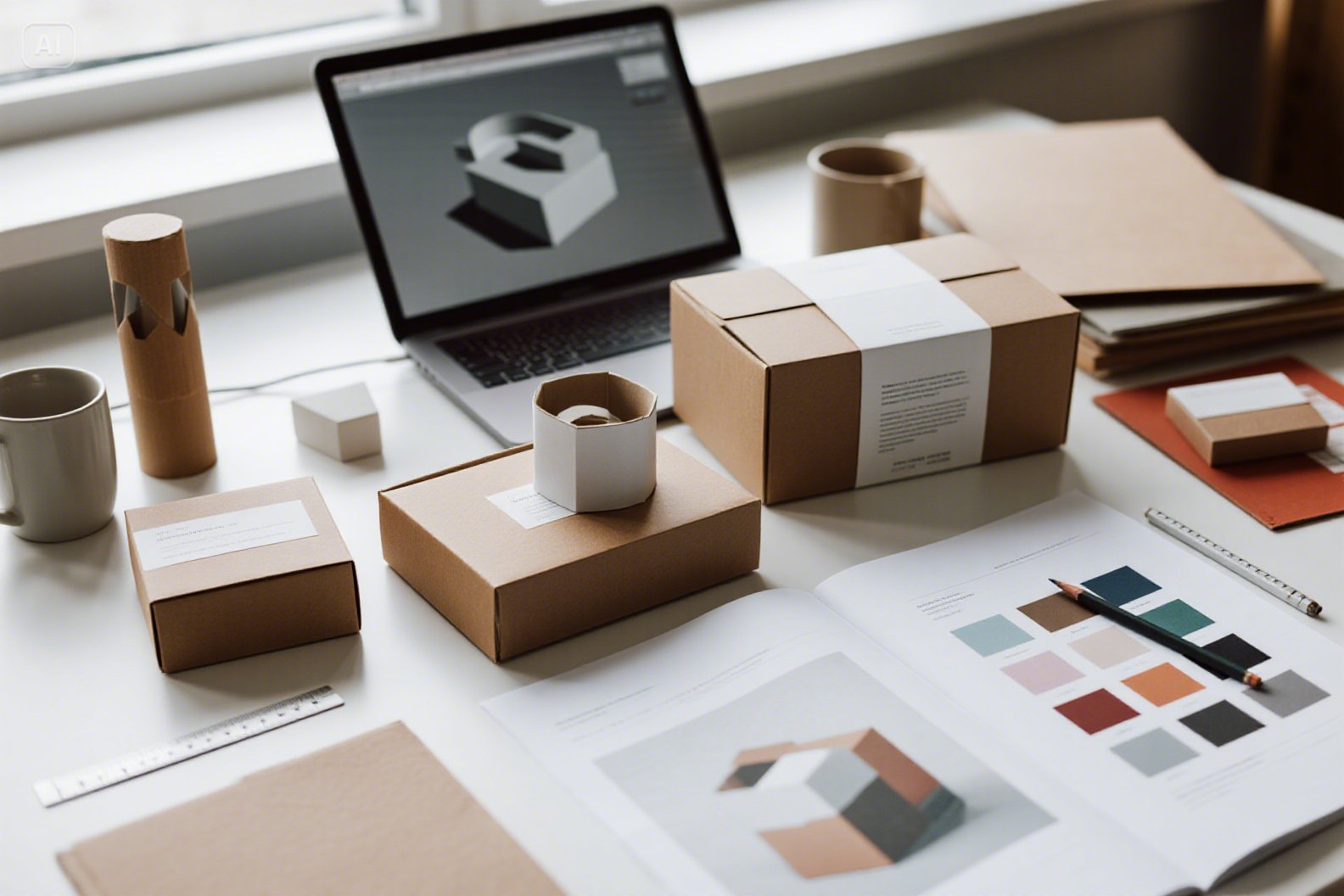
Industrial design principles apply to packaging and print materials the same way they apply to physical products: you design from how the item will be made, handled and used, not just how it looks on screen. In practice that means choosing structure and materials for the job, designing for efficient manufacture, testing physical prototypes, building modular systems that scale across a range, and considering the whole life of the piece from press to recycling bin.
A box, label, brochure or poster designed this way costs less to produce, works better for the customer and communicates the brand more clearly. Below, each principle is translated into concrete decisions for your next print or packaging project, followed by the file-prep basics printers ask about and a checklist you can reuse.
What Industrial Design Means for Packaging and Print
Industrial design is the practice of designing products for mass production. It balances form, function, usability, cost and manufacturing constraints. Packaging and print are manufactured objects too: they are cut, folded, glued, filled, shipped, stacked, handled and eventually thrown away. Treating them as products rather than flat graphics is the core shift, and it changes who you talk to and when. A graphic designer working alone tends to finish the artwork and then hand it over; an industrial design approach brings the printer, the packer and the end user into the process from the start.
| Industrial design principle | Packaging application | Print application |
|---|---|---|
| Form follows function | Box protects, stacks and opens easily | Layout readable at the real viewing distance |
| User-centered design | Easy opening, clear instructions, accessible text | Logical reading order, clear calls to action |
| Material selection | Board grade, flute type, coatings, inserts | Paper weight, finish, durability |
| Design for manufacture | Standard dielines, fewer assembly steps | Standard sizes, simple folds, efficient imposition |
| Prototyping | Physical mockups and drop tests | Printed proofs and folded dummies |
| Modularity | One structure, many product variants | Shared grid and templates across a campaign |
| Life-cycle thinking | Mono-materials, right-sized boxes | Recycled stocks, lighter ink coverage |
1. Form Follows Function
Start with the job the piece has to do. A shipping box must survive drops, compression in a stack and rough handling in a warehouse. A retail box must also stand out on a shelf from several feet away and tell a shopper what is inside within seconds. A poster has to be read by someone walking past, so headline size, contrast and the amount of copy matter far more than fine detail.
A useful exercise is to write down the three things the piece must achieve, in priority order, before anyone opens design software. For a subscription mailer, that list might read: arrive undamaged, feel like a gift when opened, and be easy to flatten for recycling. Every later decision, from board grade to the number of colors, can then be judged against that list, which also makes design reviews faster and less subjective.
2. User-Centered Design
Industrial designers watch people use things. Do the same with your packaging and print, and test with people who have never seen the design:
- Opening: can someone with limited grip strength open the pack without scissors? Tear strips and clear “open here” cues reduce frustration and product damage.
- Information hierarchy: what does the user need first? On food packaging, that is usually the product name and variant; on a flyer, the offer and how to act on it.
- Legibility: small, light-colored text on busy backgrounds fails in real life. Check contrast and minimum type sizes, and follow any labeling rules that apply to your product category.
- Context of use: instructions read in a dim garage or a steamy kitchen need larger type and simpler diagrams than a brochure read at a desk.
- Disposal: tell people how to break down and recycle the pack, in plain words, on the pack itself.
A common mistake is approving designs only on a large, bright monitor. Print the panel at actual size, hold it at arm’s length, and look at it under ordinary room lighting before signing off.
3. Material Intelligence
Material choice affects protection, cost, shipping weight, sustainability and how the brand feels in the hand. It is also one of the hardest decisions to reverse once tooling and stock are ordered.
- Corrugated board: thinner flutes (such as E-flute) print well and suit retail and mailer boxes; thicker flutes (such as B or C) give more cushioning for shipping heavier goods.
- Folding cartons: paperboard suits lighter products, with coatings chosen for moisture or grease resistance where needed.
- Paper stocks for print: heavier stocks feel more premium and last longer; coated papers make colors pop, while uncoated stocks feel natural and are easier to write on, which matters for forms and coupons.
- Finishes: matte, gloss, soft-touch lamination, spot UV, embossing and foil each add cost and can affect recyclability, so use them where they earn their place.
Ask your supplier for physical swatch books and blank samples. Feeling two board grades side by side tells you more than any spec sheet.
4. Design for Manufacture
Design for manufacture (DFM) makes sure a design can be produced efficiently and consistently, run after run. For print and packaging this means:
- Starting from standard box styles and dielines your supplier already has tooling for, rather than a fully custom structure.
- Using standard print sizes so pieces fit efficiently on press sheets with less waste.
- Limiting complex folds, die cuts and multiple finishes to where they clearly pay off.
- Considering assembly: is the box erected by machine or by hand? Fewer steps and no loose parts speed up packing and cut errors.
- Allowing realistic tolerances, since folding and cutting are never perfectly precise; critical artwork should not sit right on a fold.
A striking die-cut brochure that takes weeks longer to produce and costs several times as much is rarely the smart design, however good it looks in a portfolio.
Print-ready file basics
- Bleed: extend backgrounds beyond the trim line, commonly 1/8 inch (about 3 mm), so no white edges appear after cutting.
- Safe area: keep text and logos a similar distance inside the trim.
- Resolution: 300 ppi at final size is the usual target for images in close-viewed print; large posters seen from a distance can use less.
- Color: supply CMYK files for process printing, and specify spot colors when exact brand color matching matters.
- Dielines: keep cut and fold lines on a separate, clearly labeled layer for packaging.
- Fonts and links: outline or embed fonts and package linked images so nothing goes missing at the printer.
5. Iterative Prototyping
Screens mislead you about scale, color and feel. Before committing to a large run, print and fold mockups, put a sample box on a shelf next to competitors, and hand prototypes to people who have not seen the design. For shipping packaging, pack the real product, then drop it, stack it and send a few test units through the mail. Ask the printer for a hard proof whenever color accuracy matters. Small tests like these are cheap compared with reprinting thousands of units.
For posters and short runs, desktop tools make quick testing easy. Online design tools such as Adobe Express let small teams design and print your own posters for proofing or small campaigns, and a capable home or office inkjet like the one in our HP Smart Tank 5101 review is handy for paper mockups and folded dummies before you send files to a commercial printer.
What to test on a prototype
- Fit: does the product sit snugly without rattling or crushing?
- Opening and closing: is it intuitive, and does the closure hold after a few uses?
- Shelf or mailbox impact: is the key message visible from the angle people will see it?
- Durability: does the print scuff, crack on folds or smear when handled?
- Color: does the brand color match approved samples under normal lighting?
6. Modular Design Systems
Industrial designers build product families from shared components. Apply the same thinking by creating one packaging structure that fits several products, with variants distinguished by color, band or label. For print, set a grid, type scale and template set that every flyer, poster and brochure follows. Modular systems save design time, keep the brand consistent, reduce tooling costs and make reorders predictable. They also make it easier to brief new designers or agencies, because the rules are written down rather than living in one person’s head.
7. The Emotional Layer
Packaging is often the first physical contact a customer has with a brand. Industrial design pays attention to how things feel: the resistance of a lid, the weight of a card, the order in which items are revealed. A thoughtful unboxing sequence, a tactile paper stock or a poster in an unexpected format can make people keep, share or photograph the piece. The aim is intentional experience, not decoration, and it should still pass the function and cost tests above.
8. Sustainable Design Is Smart Design
- Right-size packaging: less empty space means less material, less void fill and lower shipping costs.
- Prefer mono-materials: packs made from a single material are easier for customers to recycle than mixed laminates.
- Design for disassembly: if you must mix materials, make them easy to separate.
- Use recycled and certified stocks: ask your printer about recycled content and responsibly sourced paper.
- Print only what you need: shorter digital runs reduce waste from outdated stock when designs or prices change.
Sustainability and cost often point the same way. A smaller, simpler box uses less board, packs more units per pallet and costs less to ship.
Common Mistakes to Avoid
- Designing the artwork before the structure is settled, then forcing graphics onto awkward panels.
- Specifying premium finishes everywhere instead of on one focal element.
- Skipping a physical proof to save a few days, then discovering color or fit problems after the full run.
- Ignoring how the piece will be stored, shipped and displayed.
A Checklist for Small Brands
- Define the piece’s top three jobs before designing.
- Talk to your printer or packaging supplier early about stock sizes, materials and lead times.
- Build from standard structures and templates, then add your visual identity.
- Prototype physically and test with real users.
- Check files for bleed, resolution, color mode, fonts and dielines.
- Review materials and finishes for cost and recyclability.
If you do not have in-house design skills, a freelancer or agency can help, and our guide to content creation services, costs and packages covers what to expect when hiring.
Frequently Asked Questions
What is industrial design in packaging?
It is the practice of designing packaging as a manufactured product. It balances protection, usability, materials, production cost and appearance rather than focusing on graphics alone.
What does design for manufacture mean for print?
It means designing pieces that print efficiently and consistently. That covers standard sizes, simple folds, sensible finishes and correctly prepared files with bleed, resolution and color set up properly.
How much bleed should a print file have?
A common standard is 1/8 inch, about 3 mm, on each edge. Always check your printer’s specifications, as some products and presses need more.
Why prototype packaging before printing?
Physical mockups reveal problems with size, fit, opening, color and shelf impact that are not obvious on screen. Fixing them at the mockup stage is far cheaper than reprinting a full run.
How can packaging be more sustainable?
Right-size the pack, use single materials where possible, choose recycled or certified stocks and make any mixed components easy to separate. Printing shorter runs also cuts waste from outdated stock.
Bottom Line
Treat every box, label and poster as a manufactured product: define its jobs, design around real materials and production, and test a physical prototype before you print at scale. Those three habits from industrial design will save money and make your packaging and print work harder for the brand.